Thursday, December 31, 2009

Happy New Year!

Taking a bit of a break from my Eduardo posts (I will return to that again) I'd like to start showing more non-Eduardo work into this blog. I've been doing some concept work for personal projects, and recently started making art for someone else's game, an unannounced project.

It's a sidescrolling game, and the first thing I did was create some bricks. I just had the idea "bricks" and went from there, with no real idea how everything would end up. It's a fun and adventurous way of making art at times, though usually I have a clearer idea of what I'd like the finished project to look like before I start. This time though I only saw one step ahead the whole way through.

I finished the middleground first, thought it could use some vines, then started work on a suitable background. Everything was done on computer obviously, but I used textures that I created with traditional media and layered them together. Similar to the proccess I used in some levels in Eduardo but more refined, and using many more layers.


(click for full view)


Below is the background I made using a lot of the same textures.


I love creating art for games so if any of you reading this are programmers in need of an artist for your game, drop me a line and I'd love to talk. I'm going to be creating art for my portfolio anyhow, so it might as well be for an actual game.

-Daniel

Wednesday, November 25, 2009

ASSETS: LEVEL 4

Level 4 was another one of those very early concepts that evolved over the years. The basic idea was to make a level using assets similar to those from the first area of the game and transport them into a grainy black and white movie world. Everything in the middleground was in silhouette and this idea lasted until we brought the game over to WiiWare. For gameplay purposes silhouetting simply wasn't going to work; there was just too much going on and you wouldn't be able to tell what's what.

Below is a rough timeline showing how the look changed (click for full size):


Note that this isn't a complete, comprehensive look at the silhouette theme. I want to show how the cloudy silhouette theme changed. In a future post I will show discarded areas and different versions of this theme, and the Torque Eduardo screenshot is a glimpse of that.

As usual, very few assets were used to make up this level. Many of them based on assets from level 1.

(click for full size)


Below is a reference mock-up using final assets.


(click for full size)


And here's an in-game screenshot from the final game:

(click for full size)


The grain is exaggerated in the screenshots--don't ask why. It should look more subtle on your tv screen. Of course, as it always happens, whenever I look back at the game I feel like changing this and that and in this case toning down that grain a bit. But that's okay, I'm satisfied with the end result all things considered. Take what you learn from the past and apply it to whatever you do next, right?

-Daniel

Wednesday, November 4, 2009

ASSETS: Levels 2 & 3

Level 2 and 3 both have assets based on those from the first area. Long ago in one version of Eduardo we were going to split up levels into worlds-levels, similar to something like Super Mario Bros. 3. World 1 would have its own theme, world 2 its own theme, etc. This carried over into the final version of Eduardo in a couple of ways: the first three levels and then the final level which is split up into four parts. At one point we had a bamboo world with three different variations and I hope to delve into that later on.

I've mentioned in previous blog posts about how my own process of asset creation changed over the years, and level 2 represents an example of some older sensibilities. I was inspired by some Japanese woodblock prints for this level, for the background sky and the bridge which you happen upon toward the end of the level. By "inspire" I mean that I rather shamelessly recreated the bridge from one particular print:


I changed it a bit but it was a pretty close recreation done in photoshop. If I were to do something like that today it would look completely different, and most likely be done on paper first. I always try to improve my processes and techniques, and this is an example of learning from working.

So just like level 1, level 2 had to use very few assets, shown below (not pictured: the overlays used, which in most cases were the same ones from the first level).

(click for full size)

Concept image using assets from the game:
(click for full size)


Onto level 3.

Similar as before, but as the only vertically-scrolling level I decided to add a few more hills for the parallax layers. I rather like the way this one came out. It's also the only level where I didn't create the background from scratch. It worked best to use a real space photograph and add a bit of color to the bottom of it.

(click for full size)

That's all for now!

-Daniel

Thursday, September 24, 2009

Assets: Level 1

With Eduardo I wanted to be able to bring something visually different to games. From the beginning of development where I didn't know what I was doing up until we sent the game to Nintendo, I just wanted to do something different, something aesthetically appealing or interesting. I took a lot of risks--some paid off and others didn't. The way I've always worked is that I have an idea and I go for it. Essentially I work and learn and refine until I'm satisfied. I work as much as I can and learn while I'm creating.

I had this vision of doing something unique with Eduardo's visuals, but I also had to deal with technical limitations. Our total file size was very low, and if I had it my way I would have created each level as layers of unique drawings instead of repeating patterns that have to be used over and over again. I decided to save a lot of space for the finale of the game as detailed in this post, so the challenge was to come up with nice-looking locales using as few assets as possible.

The first level's assets come to a little over 1MB as png files. The way we did the terrain for almost all of the levels was by using a single repeating texture, usually one just 256x256 pixels, and filled in a polygonal mesh. To get the best visual effect possible we had to forgo this method for many of the background layers, even when they were comprised of similar repeating textures. For example, in level 1 I wanted two parallax scrolling hills in the background which needed to have a shadowy gradient, and it looked best when we merged the gradient with the hills themselves. So in some cases we used big images instead of polygonal meshes. In all middleground cases aside from the last level and the shmup levels, however, polygonal meshes were used.


(above: 256x256 repeating texture used in level 1)


I laid out
all of the levels in programs like photoshop. In most cases I could figure out how an entire level would look within a single 854x480 image since we had to repeat about a single screen's worth of images over an entire level. We had to make repetition work, and I think we were able to pull it off successfully.


(above: a photoshop mock-up using assets from the game. click for larger image)
(below: screenshot from the game.
click for larger image)


Here are the assets used for the environment in level 1, layered on top of each other:


I usually had a few parallax scrolling background layers and every level aside from a few used overlays. They were simple gradients and textures placed over everything else for added polish. For the first level we also had petals dropping in the foreground. I show one such petal in the above image but we actually used four images as an animation.

It can be a fun challenge to work within such limitations, so please don't take my comments as being resentful over the process. It was a tremendous opportunity to make a game for a major platform and I always love a good challenge.

Next time: Level 2.

-Daniel

Ich bin zurück

Now that Eduardo has been out for a few months and people have had a chance to play it (and hopefully derive some enjoyment from the experience), I think it's time that I finished the job I started here.

The main purpose for creating this blog was to detail my process in creating the art for Eduardo. Starting now I am going to go level-by-level and show how I put together assets for the game. I'll try not to repeat myself, so for certain levels where I previously went into detail about art creation I will skip over those details but provide a link to previous posts.

That's the goal, but if there is anything anyone would like to know about any aspect of Eduardo, send me an email (daniel [ a t ] semnatstudios.com ) or leave a comment below and I'll do my best to answer your questions.

Daniel

Monday, June 8, 2009

It's coming!

We found out just hours after I made that last post but wanted to wait until today to make the announcement. But Eduardo is ready for release in N. America: next monday! Just 800 points. Not bad, eh?

Thursday, June 4, 2009

Updates

We have an updated trailer up on the Nintendo Channel (viewable through the Wii itself). It was on the last page the other day, hopefully it's still there now, somewhere. We should also have some stuff put up on nintendo.com tomorrow.

Now we're just anxiously awaiting the release, hoping we pass lotcheck soon. Cross your fingers, folks.

My plan is to be updating the blog more often as soon as the game comes out. That way people will have a bit more context for the behind-the-scenes stuff.

So anyhow, since Eduardo has been finished for a while now we've been working on a prototype for a possible second project, and I've been experimenting with different art processes to see what direction I want the art to take. I'm not going to show any of that, but I thought it would be fun to recreate a screen from one of the 2D Metroid games (a favorite series of mine) using the process I'm currently messing around with. I laid out all of the inks with a bamboo stick two nights ago right before going to bed, and then spent a few hours trying to get some decent colors in photoshop. This is just a recreation of a scene, we're not actually making a Metroid game.

Here you go.

Tuesday, April 28, 2009

off topic post #2

I'm doing a little project for school right now and it's kind of a videogame. A weird, few minute-long game that most people are probably going to hate, but I thought it would be nice to offer it for free once it's finished (couple weeks I'd say). I came up with the simple idea and created most of the assets for a drawing class last semester, and this semester Robert and I are actually turning it into a playable game-sorta-thing (for the PC).


(click for full resolution)


Lot of fun doing the art, and at the very least the visuals should make it interesting. Everything is animated (including the big background), so it should look neat.

Monday, April 20, 2009

evolution of a level: the bamboo.. uh, level

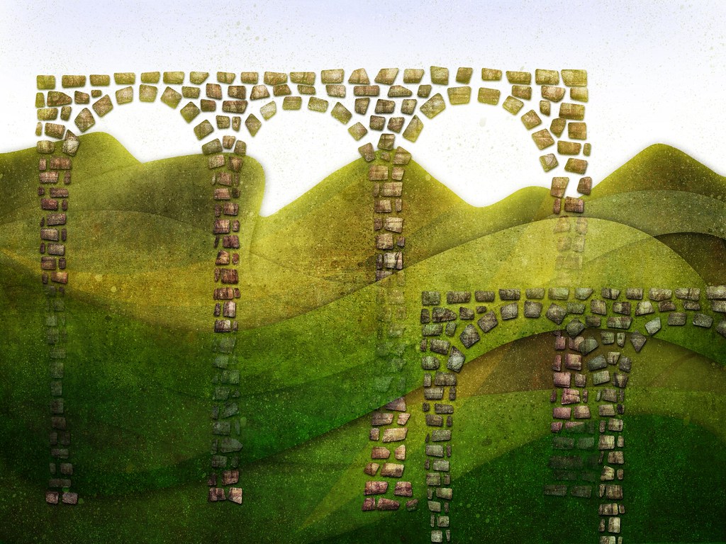
The bamboo level, or level 12 as it's now called, went through around as many revisions as the grass level. Due to my poor backup organizing, this isn't quite a complete look at the evolution of the level, but it's close enough.

Like the grass, the bamboo idea was there very early on in development. So I had a long time to work on it. This is basically how my process has worked:

1. Have an idea, draw assets.

2. Be satisfied with my work, or hate it and start all over again (and go back to step 1).

3. Put the assets together in photoshop or something similar to create a mock-up of how a level would look like.

3. If satisfied, I will probably start disliking it within days.

4. Repeat process 5-20 times until finally, totally satisfied.

There are a few levels where I got it mostly right the first or second time, but for the most levels this is how I've worked. So what I've learned is that if I'm not completely satisfied with my work and I think that I can do better, I should give it another go. Experiment as much as possible. And if I get stuck, I'll work on something else and come back to it later.

(click for larger picture)


These two pictures were done in Painter IX, before I really tried using traditional media. The thin black lines in the second picture made it to one version of the area but I can't find that so I'll show how I used some of these other bamboo stalks for another version.


(click for larger picture)

I liked this at the time, and proceeded to make some foliage to go with it:


(click for larger picture)


Not too bad I suppose, but it didn't feel right. I think the problem here was that everything looked too stiff, too rigid and perhaps even a bit plastic-like. And the terrain outline didn't do it for me. So I tried some more, this time attempting to create a painterly terrain texture and changing the leaves:


(click for larger picture)

Kind of a step back in many ways, huh? The ground texture reeks of lame photoshop filtering and the vignetting (something I think I figured out later) was absurd. The lighter leaves were a step in the right direction, providing some translucency which helps when you're dealing with parallax layers. Still, this wasn't looking good.


(click for larger picture)

Here's another attempt. Different terrain again, and different leaves. The leaves here are actually in the final assets, albeit arranged quite differently. The mist is present because at the time the bamboo world was going to be split into three levels: a day level, a misty level, and a night level. This made sense back in 2006 when I didn't have as many ideas for level themes. I remember being pretty happy with this mock-up for a little while, but I revisited the bamboo concept later on after I started using traditional media for the artwork.

The first step towards going that route was in April 2007 when I experimented again:


(click for larger picture)

Yikes. Well I wasn't satisfied before so I kept on experimenting, and in an attempt to create more 
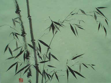
sumi-e styled bamboo, I created bones. One good thing did come from this one though, and that was using scanned-in media for the leaves, as weird as they looked:I was introduced to a certain kind of mixed media process by one of my art teachers, a process I was quite taken by. It's basically a wet/dry process of layering charcoal and acrylic paint. I believe it was the bamboo level where I first decided to use this process instead of going the computer-painting route. Here are some terrible scans of the assets now present in the final level of the game. All done on gessoed newspaper with layers of charcoal and acrylic.


The funny(sad?) thing is that I never rescanned them. I thought it was okay at the time, and what you see in the game are these scans, cut out and messed around with in photoshop. I never felt the need to rescan them.

For the ground textures I used the same process and created three sets of textures and blended them together in photoshop. I could only find two of the scans in time for this post, the third one having bits of twigs mixed in with the charcoal and paint.


(click for larger picture)


I didn't really know what I was doing. Again, just experimenting, trying out new techniques. And I liked where it was going. Here's an early piece of concept work using these assets:


(click for larger picture)

I spent quite a long time figuring out how to use these assets. This is one of many concept works I made--I was finally getting somewhere satisfying with the bamboo level after years of working on it. And after this I did just about every proceeding bit of artwork using traditional media.

Here's the final bit of concept/reference work I made for the bamboo level, using final assets from the game. If you pay close attention you'll see those twigs in the ground textures I was talking about:


(click for larger picture)


And here we have the level in the final game:


(click for larger picture)


Overall I'm pretty satisfied with how the level came out (especially in motion). I learned a lot during this process and at the very least I have a rough system in place for asset creation. I'm looking forward to trying out new methods and techniques for future games if we get the chance (*psst*buy our game!*psst*).

-Daniel

Friday, April 10, 2009

imagine (toasterz)

If Eduardo were a retail game and I could choose my own box, ignoring market realities and simply doing what I felt was creatively fulfilling, the box might look a little something like this:

(click to enlarge)

Thursday, April 9, 2009

I suck at updating

After we completed development I thought that I'd have more time on my hands, but that didn't turn out to be the case. There's still much to do! More press releases, gotta finish that final trailer, take more screens, and get everything ready for a European release (as much as we can prepare now, anyhow). And then there's school stuff, and prototyping for a potential future project. But I'll try to update the blog more often with more process-oriented posts.

Oh, and here's an interview I did recently. Nice guy, and I feel ashamed for missing the Arrested Development reference at first.

Thursday, March 19, 2009

WOOOOOOOOOOOOOOOOOO

Today we passed a huge milestone and can finally, thankfully, take a break. For a bit, while we work on the final trailer and then get to work on translations and ratings stuff for other territories.

Celebration will take place when we get a release date, however.

Wednesday, February 18, 2009

off topic!

This has nothing to do with us, but I wanted to point out a great interview with Katamari and Noby Noby Boy creator Keita Takahashi. I'm a big fan of Katamari and can't wait to play this bizarre new creation of his.

I thought this was hilarious:


Eurogamer: Did your bosses at Namco complain when you said you didn't want the game to have objectives?

Keita Takahashi: As my hierarchy only complains and only talks about the so-called "right things" to do when creating a game, I just tried not to care about what I was being told. To be honest, I don't really remember. But I was told something like "make it look more like a game", "make it easier to understand", "make it more accessible" I think.

Ha ha, so great.

Tuesday, February 17, 2009

Nintendo Power

Just a quick note, we have a two-page interview in the newest Nintendo Power (the one with the Indiana Jones cover). What luck!

IGN also has a couple of exclusive videos that were put up a week or so ago, so head over there if you want to see some more gameplay footage.

Wednesday, February 4, 2009

first video

We finally got some video recorded! We only got our capture card last week so this was done very quickly. When the game is about to launch we'll make a couple more trailers and take some more time creating them.

German gaming site GamingXP quickly put it up and have posted a direct download but I think you need to register first.

There's also some good-quality footage over at ign.


-Daniel

Friday, January 30, 2009

finale

No other level in Eduardo went through more changes than the final level, the Seven Samurai level as we referred to it. For one thing it wasn't originally going to be the final level (it was going to be level 7. haha, get it? eh? ehh...). But I just couldn't get the look right until fairly recently. This was the final level of the game and I was basing the design off of my favorite movie, so it needed to be special. Sometime in the future I'll detail the various concepts I worked on but for now I'll try to explain how I came up with the final design.

I wanted to do something very different from what I'd done in previous levels, and I wanted the whole area to have a very active look to it. I was working with a lot of inks and charcoals in my drawing class this past semester, and the work I did during that course gave me the method for creating the art.


(above: scenes from Akira Kurosawa's Seven Samurai)


Making a WiiWare game means having to deal with a small file size, but luckily most of the art I had made for the game up until now had been done with a small file size in mind. And instead of spreading out space I decided to use about half of the art asset space of the game solely for the last level. And because of RAM limitations this level would be split up into four parts, making one extra large final level.

The idea was to draw four big backgrounds and have everything else in the middleground comprised of three images each, animating at a 10th of a second. I drew all of these middleground assets in pen, so every asset made for the final level (the only exceptions are most of the projectiles, the explosions, and Eduardo's sweatband) was done with regular media and scanned in.

Here's an example of one of the houses for the last level:


(click on image for full size)


That's one of three frames, and after cutting it out on my computer and turning it white, it looks like this:


With all of the middleground assets animating like this, that meant that I had to do the same with all of the characters in the game. So every single toaster and all of their enemies (and most of their weapons) would be done in the same fashion, like so:


I also added some texture work to the characters to help them stick out.

All of the backgrounds were done on mylar with a combination of charcoal, water, and various inks. Below is a section from one of the four backgrounds from the final level


(click on image for full size)


And here's a screenshot from the final level of the game. We'll be releasing video soon with some quick shots of the final level, so that will give a better idea of how it looks.


(click on image for full size)


-Daniel

Tuesday, January 27, 2009

grass: a magical history

In the interviews that I've done over the past few weeks I've talked a bit about the evolution of my art during the making of Eduardo, so that will be the main topic of this blog for the time being.

First I should give a quick recap of the history of Eduardo. There have been three versions prior to this WiiWare game. In 2004 we started work on Eduardo the Magical Toaster, and started over again sometime early 2005, I believe, with Eduardo the Samurai Toaster. And pardon me if I get my dates wrong(the past five years of development have turned into a big blur) but I believe it was in 2006 when we started on yet another version of the game, this time using the Torque 2D engine.

I had no idea what I was doing when we first started. I had this idea for a grass field with cacti all over the place, and so I went about making grass tiles.

This was the reference photo I started out with:


Eduardo is a sidescroller so how does grass look from a side perspective? This was the only logical answer I could think of. Makes sense, right?

Here's what I came up with:


That's the result of days of hard work, folks. I don't know when it was that I realized how ridiculous that looked, but it was then that I started looking at how other games handled tiles.

So I took a note from the All-Stars version of Super Mario Bros. 3.


See those wavy lines the tiles are made up of? SMB3 uses a lot similar patterns. So I went pretty wild with the stylization this time.


Baby steps.

This time I went to Yoshi's Island for guidance.


And I recreated a tileset from YI, one pixel at a time and combined that with the SMB3 wavy tiles.


Now that doesn't look too bad. But that's because it was a duplicate of the wonderful art in Yoshi's Island. That's how the final tileset looked in Eduardo the Magical Toaster. After we decided to start all over again with a much better engine, I tried experimenting some more.

Baby steps.

(click on image for full size)


One step forward in terms of thinking outside the box, ten steps back in terms of aesthetic design. And I was going back to my first instincts of creating something approaching reality. Horrible bright neon green reality.

Using the paint program project dogwaffle, I began making simple textures using some basic paint brushes.


(click on image for full size)


I was finally starting to think a bit more abstract. But the texture was too flat, so I tried it again.


(click on image for full size)


The tile you see right above is still a part of the grass tiles in the final game, believe it or not.

I did away with the sharp grass edges and went for a crazy fake bloom effect, a phase I had to endure for a decent amount of time.


(click on image for full size)


At least I toned down the neon thing eventually.


I forgot when we started again with the Torque engine, but still not satisfied with my grass I continued experimenting. And I finally started using traditional media.

(click on image for full size)

(above: A simple pallete knife spread using acrylic paints)
(below: A simple acrylic wash applied with brushes)


I combined these two textures with the dogwaffle one posted above, and from that, and after years of tweaking, I settled on what you see in the final version of the game:


(Above: a cut-out from the texture we use for the grass)


And remember that I'm having to deal with a small file size limit so the texture has to work being repeated all throughout the level.


(click on image for full size)

And that's all for today.

-Daniel

Next time on the blog: I show something more interesting maybe? Let me know if this blog post bored you to near death or not.